
Template Customization
Learn how to customize the visual design, color scheme, element visibility, and component styling of your store’s Re-Order storefront pages.
This guide explains how to use the Reorder Page Template Editor, configure element visibility across 4 store views, customize colors and typography, and preview design changes live before saving.
1. Before You Begin
Section titled “1. Before You Begin”Before customizing your Re-Order page template, verify these requirements in your Shopify store:
- App Embedded in Theme: Verify that the B2B Portal app embed is turned on in your active Shopify theme (
Online Store > Themes > Customize > Theme settings > App embeds). - Admin Permissions: Ensure your Shopify user account has administrative permissions to manage app settings.
2. Opening the Template Editor & Page Layout
Section titled “2. Opening the Template Editor & Page Layout”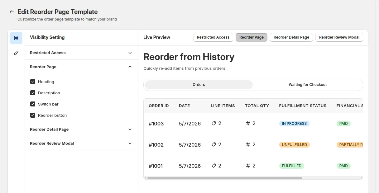
To open the Reorder Page Template Editor:
- Log into your Shopify Admin.
- Go to Apps > BSS B2B Quote.
- In the left navigation menu, select Reorder > Edit Reorder Page Template. (Alternatively, click Edit Template on the
Reorder > Reorder Settingspage).
Key Editor Features:
Section titled “Key Editor Features:”- Panel Switcher (Visibility & Style Icons): Switch between the Visibility Setting panel (grid icon) and Style Setting panel (pencil icon).
- Section Accordions: Collapsible sections for each of the 4 storefront screens (Restricted Access, Reorder Page, Reorder Detail Page, Reorder Review Modal).
- Section Accordion Headers: Expand or collapse section controls. Expanding a section automatically switches the Live Preview to that storefront view.
- Style Setting Groups: 8 grouped style controls for General typography, Color schemes, Buttons (Primary, Secondary, Tertiary), Cards, Table headers, and Boxes.
- Live Preview Window & Tabs: Real-time preview panel featuring 4 view tabs (Restricted Access, Reorder Page, Reorder Detail Page, Review Modal).
- Save & Discard Bar: Top action bar to Save design edits or Discard unsaved changes.
3. Visibility Setting Panel
Section titled “3. Visibility Setting Panel”The Visibility Setting panel lets you turn specific UI elements on or off across 4 storefront screens. By default, all 18 element checkboxes are enabled (checked).
| Section | Items you can edit |
|---|---|
| Restricted Access | Heading, Description, Go back, Log in |
| Reorder Page | Heading, Description, Switch bar, Reorder button |
| Reorder Detail | Title, Subtitle, Variant, SKU |
| Reorder Review Modal | Title, Add new items, Reset, Variant, SKU, Subtotal |
Element Checkboxes Guide (18 UI Elements Across 4 Views)
Section titled “Element Checkboxes Guide (18 UI Elements Across 4 Views)”| Section & Screen | Checkbox Name | Storefront UI Element Covered |
|---|---|---|
| Restricted Access (4 items) | Heading | Access warning title (e.g. “This page is for exclusive customers!”) |
| Description | Explanation text for guest or non-eligible buyers | |
| Go back | Button returning buyer to your store homepage | |
| Log in | Button redirecting buyer to your store login page | |
| Reorder Page (4 items) | Heading | Main page title (e.g. “Reorder from History”) |
| Description | Subtitle text below the main heading | |
| Switch bar | Dual-tab navigation bar (Orders vs. Waiting for Checkout) | |
| Reorder button | Quick reorder action buttons in order history rows | |
| Reorder Detail Page (4 items) | Title | Header title for pending draft orders |
| Subtitle | Creation date and order detail summary subtext | |
| Variant | Variant name text displayed on line-item rows | |
| SKU | SKU identifier text displayed on line-item rows | |
| Reorder Review Modal (6 items) | Title | Window header title (e.g. “Review order details”) |
| Add new items | Product search bar for adding new items | |
| Reset | Button to reset quantities back to original order amounts | |
| Variant | Variant option names below line-item titles | |
| SKU | Product SKU codes on line-item rows | |
| Subtotal | Line-item subtotal and order summary section |
4. Style Setting Panel
Section titled “4. Style Setting Panel”The Style Setting panel lets you customize colors, typography scale, border thickness, and corner rounding to match your store’s brand guidelines.
Style Groups Guide (8 Setting Groups)
Section titled “Style Groups Guide (8 Setting Groups)”- General:
- Text size: Typography font size in pixels (e.g.
14px). - Corner radius: Border rounding radius in pixels (e.g.
6px). - Border width: Component border thickness in pixels (e.g.
1px).
- Text size: Typography font size in pixels (e.g.
- Color scheme > General:
- Background color: Main content background color.
- Border color: Default container divider and border color.
- Primary text color: Headings and primary body text color.
- Secondary text color: Subtitles, metadata, and helper text color.
- Primary button (6 color properties):
- Background, Text, Border, Hover background, Hover text, Hover border.
- Secondary button (6 color properties):
- Background, Text, Border, Hover background, Hover text, Hover border.
- Tertiary button (6 color properties):
- Background, Text, Border, Hover background, Hover text, Hover border.
- Card (3 color properties):
- Card background color, Card title text color, Card border color.
- Table header (2 color properties):
- Table header background color, Table header text color.
- Box (2 color properties):
- Box background color, Box border color for order history containers.
Color Selection & Color Picker
Section titled “Color Selection & Color Picker”Each color input includes an integrated Color Picker popup and hex text input (#HEX format):
- Integrated Swatch Picker: Click the color swatch to open the visual color picker.
- Hex Color Input: Type 6-digit hex color codes (e.g.,
#005BD3,#FFFFFF,#111827) directly into the box. - Instant Live Preview: Any color change updates the Live Preview window immediately.
5. Instant Live Preview Panel
Section titled “5. Instant Live Preview Panel”The Live Preview Panel on the right side of the editor provides a real-time preview of your Re-Order storefront pages.
Switch between 4 view tabs at the top of the preview window:
- Restricted Access: Renders the guest/unauthorized access page.
- Reorder Page: Renders the main order history page with order tables and tab switch bar.
- Reorder Detail Page: Renders the pending draft order detail screen.
- Review Modal: Renders the line-item review popup window.
6. Storefront Layout & Styling Rules
Section titled “6. Storefront Layout & Styling Rules”- Fixed Page Spacing: Storefront Re-Order pages enforce fixed top padding of
24pxand bottom padding of64pxfor consistent spacing across Shopify themes. - Theme Protection: Your store theme’s main header navigation, announcement bar, mobile drawer, and footer remain 100% theme-controlled. App styles are scoped strictly to the Re-Order content area and will never alter your main theme stylesheet.
- Graceful Empty States: If a customer has no order history or if all items in an order are unavailable, the storefront renders clean, friendly warning banners without broken layouts.
- Global Persistence: Saved template settings apply globally to all eligible customer sessions visiting your Re-Order page.
7. Related Guides
Section titled “7. Related Guides”- Reorder Overview: High-level vision, target audience, and B2B repeat purchasing scenarios.
- Full Setup Guide: Setup walkthrough for customer eligibility, delivery modes, and theme embeds.
- Reorder Page & Order Tabs: Customer order history list, dual-tab switch bar, and draft order tracking.
- Draft Order Detail Page: Guide to viewing, managing, and reordering from draft order detail pages.
- Reorder Review & Edit Modal: Guide to line-item quantity adjustments, stock checks, and catalog search.
- Storefront Translation: Customize storefront text, smart placeholders, and multi-language copy.