
Customize Quote Widget
This tab controls the behavior and look of the floating “Quote Basket” widget. This widget follows your customers across the store, allowing them to view or submit their quote request at any time.
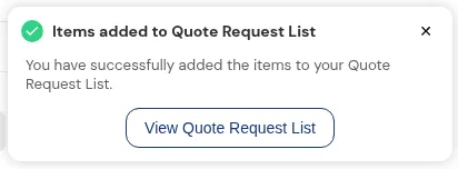
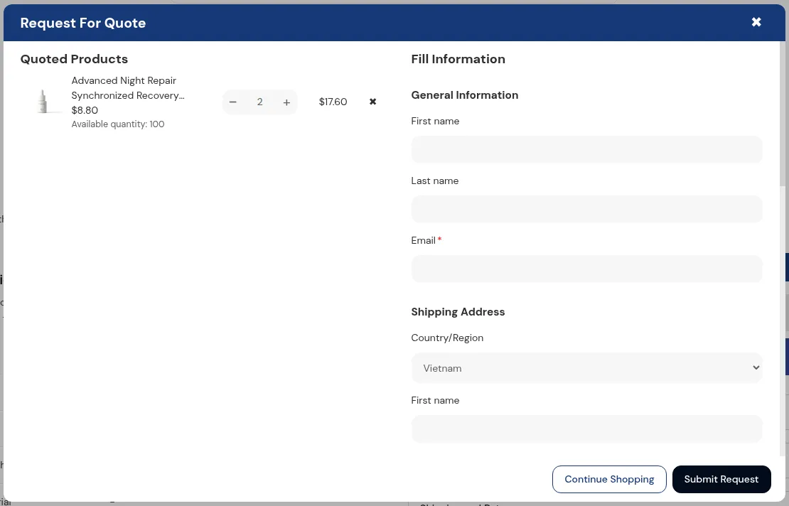
What your customers see on the storefront.
1. Overview
Section titled “1. Overview”The Quote Widget is a floating button (usually in the bottom corner of the screen). It acts like a shopping cart icon but for quotes.
On this screen, you can configure:
- Visibility: When the widget appears.
- Content: The text displayed on the button.
- Styling: Colors and shapes to match your brand.
2. Widget Settings
Section titled “2. Widget Settings”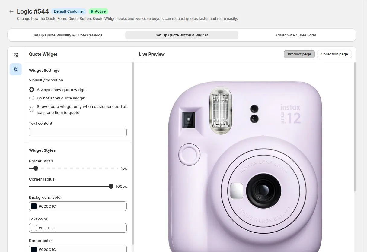
Use this section to decide how the widget behaves.
2.1. Visibility Logic
Section titled “2.1. Visibility Logic”Choose when the widget should be visible to the customer:
| Visibility condition | Behavior |
|---|---|
| Always show quote widget | The widget is always visible on the screen, even if the quote basket is empty. This encourages customers to start a quote. |
| Show only when items are in quote | The widget stays hidden until the customer clicks “Add to Quote” on a product. Once they have items, the widget appears so they can finish the request. |
| Do not show quote widget | The widget is completely hidden. Customers can only access the quote form via the “View Quote” link in the success message (toast) after adding an item. |
2.2. Text Content
Section titled “2.2. Text Content”- Widget Text: Enter a short label to display next to the icon (e.g., “Request Quote” or “My Quote List”).
- Item Counter: The widget automatically displays a small number bubble showing how many items are currently in the quote basket. You do not need to configure this; it updates automatically.
3. Widget Styles
Section titled “3. Widget Styles”Customize the design so the widget looks like a natural part of your store, not a third-party add-on.
3.1. Shape & Size
Section titled “3.1. Shape & Size”- Border Width: Adjust the thickness of the widget’s outline.
- Border Radius: Control the roundness. Set it to 50% (or max) to make a perfect circle/pill shape, or 0px for a square.
3.2. Color Scheme
Section titled “3.2. Color Scheme”You can define separate colors for the Default State (when sitting on the page) and the Hover State (when a mouse moves over it):
- Background: The main color of the button.
- Text & Icon: The color of the label and the basket icon.
- Border: The color of the outline.